They say you can’t judge a book by its cover, but every last one of us does it. That’s why the cover is there, and it’s why a great cover is so important. It’s your first chance to make an impression on potential readers, convey the uniqueness of your work, and establish expectations – so you’d better get it right!
Here’s how I did it, and at the end I’ll list some advice based on my experience and the learning curve I encountered.
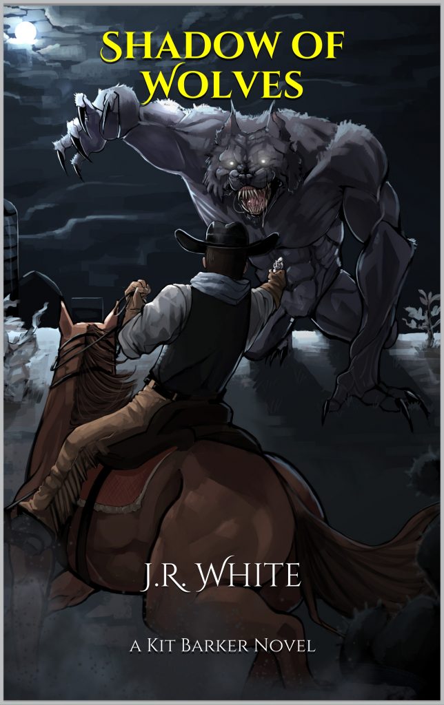
For my the cover of my first book, I knew I needed to make a statement. When writing cross-genre fiction it can be tricky to nail down your readership, so I wanted something to catch the imagination and instantly show readers if this was the book for them. A snarling monster, and a gunslinger on horseback – pistol raised and face obscured as he faces the looming threat – would do nicely.
As you can see from my concept sketch below, I had a pretty good idea what I wanted already in my head, but was a long, long way from the finished product I needed.
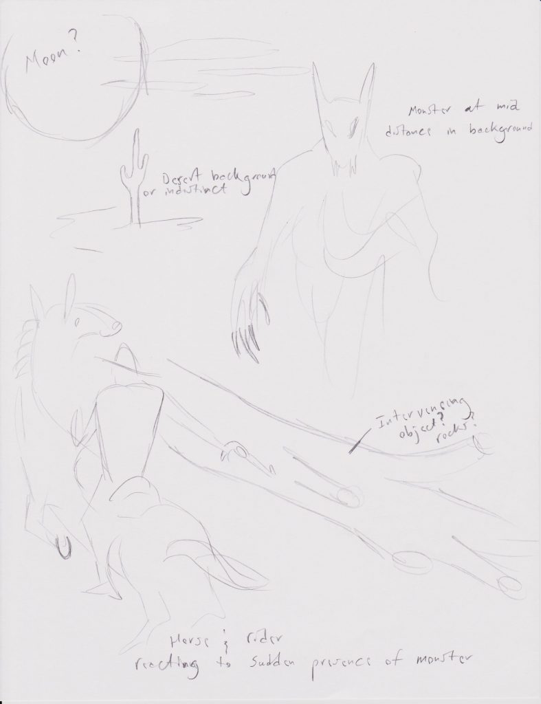
To bring the concept to life, I hired up-and-coming professional artist Cammi Sanders, who was recommended to me by my sister, also a professional artist.
“When making this cover, I had a few ideas in mind. This was the first time I’ve really done anything with this level of thought and detail behind it, so I wanted to make the cover an unforgettable one,” Cammi explained later. “Therefore, I decided to go with the pose that ended up in the final version because I believe it to be the most eye catching and hold the most dynamic action. The werewolf is front and center, more lit up making its face the focal point to instill a sort of uneasiness in the viewer. To which their eyes will inevitably fall upon the cowboy on his horse, aiming his gun at the aggressor. All in all, this was an extremely fun project to work on and I couldn’t be happier with how it turned out!”
Cammi and I communicated back and forth via the internet for several weeks while she crafted the cover, consulted with me, and made adjustments. With email, online image hosting, and electronic payment methods, we never had to meet in person as we collaborated to give me the best cover possible. The internet is awesome.
Once I was happy with the artwork, it was just a matter of transferring Cammi’s payment and having her sign and send the necessary releases allowing me to own and use the artwork. I won’t get into specifics about release types and payment amounts, because we’re free market capitalists around here and whatever you’re willing to pay and your artist is willing to accept are strictly between the two of you. (And also, if demand for Cammi’s work increases and she has to raise her rates, I don’t want all you heathens to come yell at me about it when she charges you more than me.)
As far as I’m concerned, her work was worth every penny.

This is one of the preliminary sketches Cammi sent me while we collaborated on the artwork. Already you can see the elements of my original idea being expanded on and brought to life with the artist’s own vision for the piece. A good artist will always work with you to make sure you get what you want, while also bringing their unique perspective to the project.
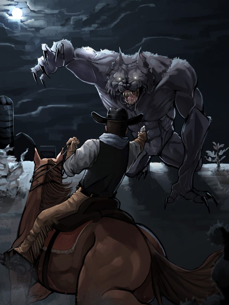
Once I had the artwork, the ball was in my court again and the next issue was adding the title and any other cover text. Cammi created my artwork with space for text in mind, so I didn’t have to worry about that. Amazon has a tool called Cover Creator to help you with this, and I strongly recommend it if your primary market will be Amazon, because it can reveal any viewing issues with the title and bylines.
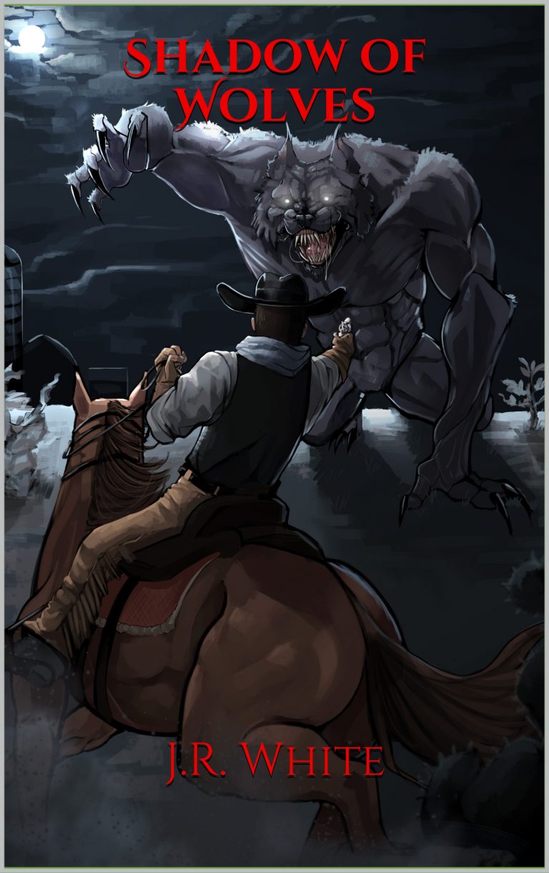
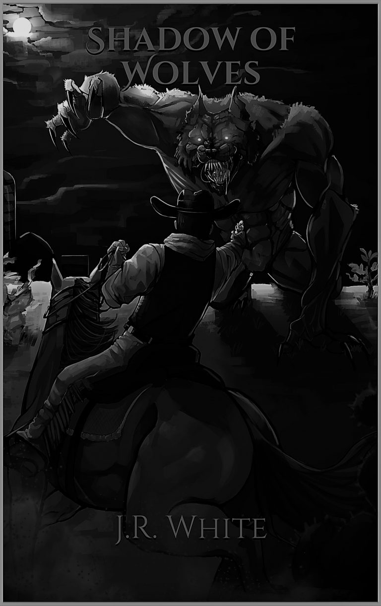
For example, in the pictures below you can see my first attempt at titling my cover art. I decided to go with a blood red text color to evoke and magnify the horror elements of the story (I launched just in time for Halloween, after all), but quickly ran into some problems. The worst of which was that the title all but disappeared when I viewed the image as a thumbnail – exactly as it would appear in many of the online listings! A similar problem occurred when the cover art and title were viewed in black & white such as on certain e-Readers (see second example below).
I needed my cover to “pop” across as many viewing options as I could get, and so a change was in order. I found the answer in the yellow text you see below. It reminds me of my descriptions of the vicious yellow glow of the creature’s eyes in the desert gloom, and I like how it glares starkly from the cover regardless of what setting Amazon chooses to present it on. I think it looks fantastic on the glossy paperback cover as well – but holding a physical copy of one of your lifelong goals is a hell of an experience to begin with, so maybe I’m biased.
You’ll have to get one yourself and see.
So here’s my advice about covers, for any of you that read this far down the post and still care about my opinion
- Have a clear idea of what sort of image you want, and what you want to convey with it, but don’t be so locked onto it that you ignore all feedback from your artist. Remember, you’re buying their skills AND their expertise, so don’t waste it.
- Don’t give away too much about the story or important plot points. Yes, I know that sounds odd coming from a guy who put his giant werewolf right on the freaking cover. In my case, I needed to make a statement about the kind of story this was going to be – western fans and horror fans don’t always overlap, and I wanted to interest both – but as readers become more familiar with the kind of stories I write I can be more cryptic with my covers. Leave something to the imagination, but steer their imagination in the direct you want.
- Be direct and open in your communications. Don’t be afraid to let your artist know how you really feel about the work – BOTH of you want the artwork to success! Praise the things you love and be frank about what you don’t.
- Tell your artist where you plan to put cover text so they can allow for it in their artwork.
- Choose the right release and deal for you. Do you want to “own” the artwork or just license it for certain uses? Do you want to buy it outright or arrange a deal based on royalties from the book? Give this some thought ahead of time. In my case, I bought the rights entirely because I knew I wanted to use that awesome image on my website, book, social media, and anywhere else I could drum up interest with it, but your needs may vary.
- Make sure the color, font, and text looks great on ALL the platforms you plan to publish on. Look at existing books on Amazon, paperback, e-Reader. Check color vs black & white. Look at thumbnails on websites like Good Reads. You may not be able to make it look perfect everywhere, but try to get it to “pop” across as many impressions as possible.
Until next time,
J.R. White


